Showing posts with label "making of". Show all posts

Saturday, January 10, 2015

The Making of "Rainy Day at the Lake"

It's a cold, wet, dreary day in Texas.  The sort of day to curl up on the sofa and read a book, or do some artwork, or watch a movie!

It got me thinking about a 3D digital artwork I created some time ago called "Rainy Day at the Lake."

I wanted a typical English scene - a cloudy, rainy day, with a family of ducks paddling across a pond in the driving rain.

Here's the image.  It's been popular on mousepads and cards in my Zazzle store, and it's also available on canvas and as prints at www.jaynewilsonart.com


I thought I would get my blog started up again this year by showing how the image was made, the steps it took to create it.

I created it in Vue, by e-On Software, a 3D digital art program.

As you work in Vue, the workspace is divided into four panes, each giving a different view of your scene. 

The top right hand pane is the view from the top - useful for placing one element behind another. From above, you can see dotted lines, which show the visual scope of the "camera" (the point from which the image is rendered). 

The area within those lines will be in your render, so you need to make sure everything is well placed.  Outside those lines, it doesn't matter and you can keep the file size down by not populating those area with lots of detail such as trees, grass etc.

Top View
 

Additional windows show you views from the front and from the side.  All these view aid in placing objects within the 3D environment that Vue creates inside your computer.  The bottom right hand pane shows you the camera view, this is how your final render will look.

Vue Workspace

The main detail of this scene would be the lake.  My vision was to have a grassy foreground, the lake in the middle ground and the far bank, with some trees and a house in the background and a stone bridge on the right, providing access to the house.  To create the lake I added a standard terrain and began "excavating." 

Terrain Editor

I'm still learning how to manipulate terrains but I knew this one didn't have to be too detailed, because of the viewpoint of the camera.  All that would be seen would be the far bank.  Everything else would be out of the view of the camera.

Then I added a water plane and applied a material, one of a purchased set with the effect of rain drops on the water surface.

The next thing to do was to add the atmosphere for which I used Vue's versatile Atmosphere editor and selected one of the stock atmospheres.  As usual I made some minor tweaks to get the general look I wanted. 

Then I  went about adding that rain. This was done by creating a cylinder object, to which I added a transparent mat that I created in Photoshop Elements with my raindrops "painted" on it.  This was centered over the camera, so the camera was actually looking through it to the rest of the scene.  I rotated it on the x axis to give the rain a bit of a slant.


Once I had the terrains and atmosphere done,  I added the other elements, such as the house and the bridge. These were purchased models which I then resized and positioned along the x, y and z axis using the "gizmos" in Vue until they were where I wanted them, and in proportionate size.


The next step is adding the vegetation -- trees, plants, grasses.  This can either be done by applying an Ecostyem to an entire terrain, or by painting the ecosystem only where it is needed.

As my system gets bogged down by huge ecosystems that populate the entire scene, I usually use the latter option and just paint them where needed. This can be done individually or with an airbrush type of effect.
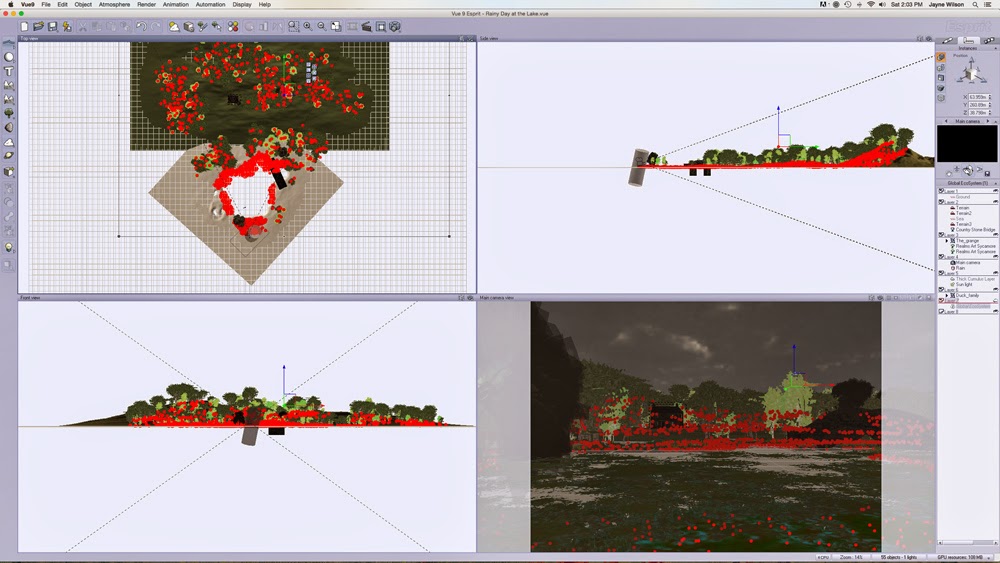
 
Ecosystem

You can see the red dots indicating the locations of the trees and grasses in this screen shot. As you can see in the top left pane, I only placed them within the dotted lines indicated the field of vision of the camera -- much easier for my computer to handle!

At this point it becomes a case of making test or preview renders, then making adjustments as necessary until I'm happy with the scene.  I usually do lots of test renders and then, when I think it's complete, I usually do one more because I always seem to find a glaring error staring me right in the face!  

But eventually I get to the point where I am happy with the finished image and can do a final render.


I hope you have enjoyed this glimpse at the world of the 3D artist.


Thursday, October 3, 2013

The Making of Country Lane in Fall

Fall is my favorite season. I love fall colors, even though we really don't get much in the way of fall color here in Texas.  It seems to me that the leaves stay green until they just drop off the trees here.

That could be why I enjoy creating artwork which features fall colors.

A couple of weeks ago I started working on a new artwork which I entitled "Country Lane in Fall".

What follows is a little detail about how I created it in Vue.  I'll show you the actual image at the end of the post :-)  As always, you can click on the images to see a larger version.

 ***

I had an idea of what I wanted, but creating it in Vue was a bit of a challenge as my technical skills are still lacking in some areas.  I'm just not very good at sculpting terrains yet.  Usually, I load a standard heightfield terrain and squish it almost flat.


That creates a nice enough base for many scenes.  I often use something like that for the foreground and then add hills in the background.

But for the scene I had in mind, I wanted a country lane, complete with cart tracks, or tractor tracks in the dirt.

Some time ago I watched a video tutorial which showed something similar to what I wanted, and it used a "heightmap", basically a greyscale image that Vue would blend with it's own fractal terrain to modify it.

So first, here is the standard heightfield terrain in Vue.  There are all sorts of tools for tweaking it and creating impressive terrains but I'm still learning how to use them.


Next, in Photoshop Elements, I created a new file and "painted" a country lane.  I used a fuzzy edged brush in grey to create the lane and then a darker color to create the deeper tracks.  (lighter colors create higher terrains, darker colors are lower)


Within the "Terrain Editor" in Vue, you import your jpeg file and specify the proportions you want to use - i.e. do you want more of the default terrain or do you want more of your jpeg image?

I selected roughly 50/50 between the two.  It gives you a rough (and I do mean rough) preview of what it will look like before you hit ok.


It was still way too deep for my taste - I wanted cart tracks, not WW I trenches, so I flattened the whole terrain down considerably until it looked something like this:


Next came the fun part of adding in the texture, the trees, grasses, weeds etc. placing the fence and getting the atmosphere the way I wanted it.


This took me literally days.  I would think I had it done and would render it, which involved leaving it to run on its own for three hours. Then I would come back and look at the render and decide I didn't like something, or discover some glaring error which couldn't be fixed in post work.

At least twice I just left the computer rendering while I went to bed, so I wasn't able to get back to the piece until I got home from work the next day.  (Work really does get in the way sometimes)

But finally, I had something I was happy with:- "Country Lane in Fall"


While I really like the original version above, this evening, I played around with it in Photoshop Elements, applying filters. (I don't have Filter Forge, like many digital artists, although if they have a version that will work with Elements on a Mac, I may shell out the bucks for it).  Instead I used the Paint Daubs filter and really love the Impressionist feel it gives the image.


I'm not sure if the Paint Daub effect is even visible at this size, but on a full size 26 " x 15" original, it looks great.  Or at least I think it does, I'd love to hear what others think, if you can even see it at this resolution and size.

I'm now in a quandry as to which version to use as my final image that I post on Fine Art America and that I use to create products for my Zazzle store.  I *think* I'm leaning toward the Impressionist version.  What do you think?